The relationship between architects and the artworks in contemporary museums is often not a happy one. The buildings are often either eccentric spaces decorated with the architect’s own idiosyncratic interventions (the Adam with its cut-away mezzanine, the New in Auckland with its awkward spaces circling a void, and that diving board) or a couple of over-scaled, difficult spaces for the museum to fill as best it can (Te Papa and the City Gallery in Wellington). There have been some successes in New Zealand. Nick Stevenson’s Artspace is one, and the new Tauranga Art Gallery has had positive art-specific commentary and looks good in pictures. But over all, purpose-built art galleries designed to show art rather than show off the architect are rare anywhere in the world. Renzo Piano’s De Menil in Houston gets a tick from us but Zaha Hadid’s Contemporary Art Center in Cincinnati doesn’t. We’d give one to Tadao Ando’s Modern Art Museum in Fort Worth Texas but not to his Contemporary Art Museum in Naoshima, Japan. Some architects understand how to create spaces that enhance the experience of art, but they are rare. Now, having just visited Kolumba the art museum of the archbishopric of Cologne, we’d add Peter Zumthor to our select list.
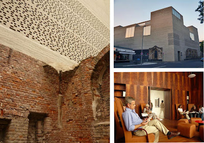
Opened last year, Zumthor’s building partly surrounds the excavated foundations of the Gothic church St. Kolumba. This was a project with a lot of constraints from the outset. For this part of the construction, Zumthor extended the ruined walls of the old church into a delicate breeze block wall that lets traffic noise and weather drift into the high-ceilinged internal space. Breeze block sounds mundane but here the effect has faint echoes of Islamic filigree. The rest of the building is occupied by galleries and offices etc. The height of some galleries teeters on the extreme until it is brought into balance by the strange and wonderful mix of contemporary art and ecclesiastic relics. Most of the walls are painted and then rubbed pale grey although one space, featuring the Archbishopric’s treasures, is padded with black velvet (sounds cheesy but in fact achieves the sense of infinite space you get from a really good James Turrell along with great soundproofing). Zumthor seems to get the fundamentals of experience right every time. He truly think about us! From the luxury of the spectacular, wood-panelled library to the front door handles where the inside set are hand-bound with metal wire, the details are perfectly timed and realised. And for once, the building feels even better in life than it looks in photographs.
Images: Left, the ruined wall meets Zumthor’s breeze bricks. Right top, the building, bottom the reading room
Thursday, July 10, 2008
Icon
Posted by
jim and Mary
at
7:10 AM
![]()
![]()
Labels: architecture


